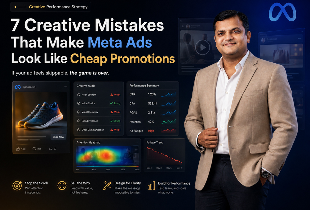
If your audience feels the urge to scroll past your ad in the first millisecond, the game is over. Most Meta ads do not fail because the product is bad. They fail because the creative feels like a cheap, low-value promotion. Once an ad looks cheap, your audience does not pause, does not trust, does not click, and does not convert.
That is why a Meta Ads creative strategy is not just a design problem-it is a revenue problem.
Data backs this up. An analysis by NCSolutions and Circana found that advertising creative drives 49% of incremental sales, making it the single largest driver of advertising effectiveness. When your ads look cheap, your brand looks cheap, directly spiking your Cost Per Acquisition (CPA) and tanking your Return on Ad Spend (ROAS).
To fix ad fatigue and scale revenue, you must eliminate these seven critical creative mistakes.
1. Starting With a Discount Instead of Desire
The fastest way to make a Meta ad look cheap is to lead with desperation: “Flat 50% Off,” “Buy Now,” or “Limited Time Offer.” While discounts have a place, leading with price trains the customer to see cost before value.
Premium creative does not start with desperation; it starts with desire, pain, aspiration, proof, or transformation. For D2C, B2B, and SaaS brands alike, customers are not just comparing products-they are comparing trust.
- Cheap Creative Says: “Buy this product because it is on sale.”
- Performance Creative Says: “This product solves a specific problem, reduces friction, or gives you a superior outcome.”
| Weak Hook | Stronger Performance Hook |
|---|---|
| Flat 40% Off Today | Your skin barrier may not need 7 products. |
| Buy Now | The daily bag built for airport-to-office movement. |
| Best Quality Product | Why 18,000 founders switched to this workflow. |
| Limited Offer | Stop wasting 30 minutes every morning on this task. |
Discounting can be introduced later in the funnel. The first frame must establish perceived value.
2. Using Template-Looking Designs That Kill Trust
Ads look cheap when they look identical to every other brand in the feed. The same Canva-style layouts, loud badges, fake urgency countdowns, and generic product cutouts create visual noise rather than pattern interruption.
People do not stop scrolling because your ad has more elements; they stop when the visual gives them a distinct reason to pause.
- What Cheap Design Signals: Low brand maturity, poor product quality, generic positioning, and a suspicion that the brand is simply dropshipping low-tier goods.
- What Premium Performance Design Signals: Clear visual hierarchy, strong product focus, trust-building social proof, a controlled color system, and real customer context.
The goal of direct-response design is not to make an ad “beautiful” for a design portfolio. The goal is to reduce cognitive friction and make the buying decision easier.
3. No Visual Hierarchy: Everything Is Screaming
Cheap ads suffer from a chaotic layout where every element demands equal attention: a big headline, a big price, a big discount badge, a massive testimonial quote, and an oversized Call to Action (CTA) button. When everything screams, nothing gets understood.
A performance-driven ad creative requires strict visual hierarchy. The viewer must process the message seamlessly in less than 3 seconds:
- Primary focus: Hook or product outcome (What is this about?)
- Secondary focus: Product context or core proof (Why should I care / trust it?)
- Third focus: High-contrast CTA or offer framing (What should I do next?)
Visual psychology dictates that contrast, whitespace, typography weight, and product placement must guide the eye along a single, intentional decision path. Design should serve as direction, not decoration.
4. Weak Hooks in the First 3 Seconds
The human brain processes visual data in milliseconds. If a video ad takes five seconds to explain its value proposition or introduce the problem, 90% of the audience has already scrolled past. Hiding the core benefit at the end of a video is a massive drain on ad spend.
- The Fix: Put your strongest claim, boldest visual asset, or sharpest customer pain point in the very first frame. Use clear text overlays and immediate pattern interrupts. If you are selling a workflow software, show the clean, finished dashboard immediately-not the step-by-step login process.
5. Repeating the Same Creative Until Fatigue Kills Performance
Creative fatigue is a platform-level issue that quietly destroys scaling efforts. Meta explicitly notes that creative fatigue occurs when an audience has been overexposed to the same visual asset, causing Click-Through Rates (CTR) to drop and CPAs to climb.
The mistake most brands make is executing a weak refresh: changing a background color slightly, swapping one word in a headline, and calling it a “new creative.” That does not trick the algorithm or the audience.
- Weak Refresh: Same angle, same product shot, same layout, same emotional trigger.
- Strong Refresh: Introducing a completely new customer problem angle, switching visual formats (e.g., from a static split-screen to a native Reels video), leveraging a different type of proof, or changing the primary opening frame entirely.
To satisfy Meta’s system and maintain low CPAs, you must diversify creative assets rather than just producing cosmetic iterations.
6. No Proof, Only Claims
Cheap Meta ads rely on empty, unverified claims: “Best quality,” “Trusted brand,” or “Loved by thousands.” These phrases carry zero weight unless the creative provides immediate, believable proof to mitigate consumer risk.
Direct-response visuals must show, not just tell:
- For D2C & E-commerce: High-resolution texture shots, real usage demonstrations, side-by-side product comparisons, material breakdowns, or authentic customer lifestyle contexts.
- For SaaS & EdTech: Real dashboard screenshots, clear before-and-after workflow metrics (e.g., time saved), verified client transformations, or expert-led framework illustrations.
7. Testing Creatives Without a Real Testing Framework
Uploading random ad variations into a campaign and waiting to see what happens is not testing-it is gambling with your marketing budget. To build a repeatable growth engine, you must establish a structured creative A/B testing framework with isolated variables.
The Isolated Testing Matrix
To accurately determine what drives performance, test one major variable at a time while keeping other elements constant.
| Test Area | Variable Variations | Performance Insight Gained |
|---|---|---|
| Hook Angle | Pain Point vs. Aspiration vs. Curiosity | Identifies what successfully stops the scroll. |
| Visual Format | Native UGC vs. Premium Static vs. Carousel | Reveals which format commands the most attention. |
| Proof Type | 5-Star Review vs. Case Metric vs. Founder Story | Determines what best eliminates purchase skepticism. |
| Offer Framing | Dollar-Off vs. Percentage-Off vs. Risk-Free Trial | Uncovers what reduces transaction friction. |
Decoding the Data: Beyond Basic CTR
If you are only looking at Cost Per Click (CPC) and overall Return on Ad Spend (ROAS) at the campaign level, you are blind to actual creative performance. Elite media buyers and creative strategists look at micro-metrics to diagnose exactly where an ad is failing:
- Thumb-Stop Ratio (3-Second Video Plays / Impressions): This measures the raw power of your hook. If your thumb-stop ratio is below 25%, your first three seconds are too weak, too slow, or visually confusing. The audience is scrolling right past. You must fix the hook before changing the core message.
- Hold Rate (ThruPlays / 3-Second Plays): This measures your core value proposition and video pacing. If you hook the viewer but lose 80% of them by second five, your ad is suffering from visual drag. The promise made in the hook is not being fulfilled fast enough.
- Outbound Click-Through Rate (Outbound Clicks / Impressions): This measures true purchase intent. A high engagement rate with a low outbound CTR means your ad is entertaining, but it lacks a clear, compelling Call to Action (CTA) or buying mechanism.
For static ads, the diagnosis relies heavily on the Conversion Rate (CVR) from Click to Purchase. If a static ad drives a massive 2.5% CTR but a 0.5% CVR on the landing page, you have a severe cognitive dissonance problem. The visual promised something the landing page did not deliver. Aligning the ad’s color palette, typography, and specific offer with the top fold of your landing page is the fastest way to plug this profit leak.
Why Pixi Labs Is the Best Partner for Solving Ad Fatigue
Pixi Labs is a specialized studio for Performance-Driven Meta Ad Creatives & Visual Intelligence. We bridge the gap between creative strategy, direct-response design, visual psychology, and conversion performance. We do not just make ads look better-we diagnose exactly why a creative is failing to convert, systematically engineering assets to lower your CPA and scale your brand trust.
Case Example: Overhauling a Premium Brand Funnel
- The Context: A mid-size brand was spending heavily on Meta Ads but facing a stagnant 0.6% CTR and a highly unprofitable $45 CPA. Their ad account was flooded with template-based, discount-heavy graphics that actively cheapened their high-ticket product.
- The Pixi Labs Approach: We eliminated the discount-first messaging and rebuilt their visual hierarchy entirely around product outcomes and authoritative proof. We deployed a structured testing matrix consisting of five distinct hook angles, platform-native video formats, and high-contrast static designs with strict text control.
- The Outcome: Within a single testing cycle, the brand’s CTR increased to 1.8%, and the CPA dropped by 60% down to $18. By shifting the visual language to reflect a premium, trustworthy solution, the brand achieved a sustainable 3x ROAS and unlocked the ability to scale daily spend predictably.
Frequently Asked Questions
What is Meta Ads creative strategy?
Meta Ads creative strategy is the systematic planning, designing, testing, and optimization of ad visuals, hooks, formats, and messaging. Instead of relying on a single guessing attempt, a mature strategy treats creative production as a data-driven engine, directly tying visual choices to hard business metrics like CTR, CPA, and ROAS.
Why do my Meta ads look cheap?
Ads look cheap when they rely heavily on generic stock templates, cluttered layouts, competing visual hierarchies, loud promotional badges, and a discount-first presentation. When an ad lacks visual control, it signals low brand maturity and poor product quality, driving away premium buyers.
How does ad creative affect CTR?
Ad creative is the primary lever for Click-Through Rate because it governs the first millisecond of user attention. The visual contrast, hook clarity, and immediate relevance of the opening frame dictate whether a user pauses or scrolls past. High-relevance, problem-focused hooks naturally yield stronger CTRs.
What are the best ad fatigue solutions for Meta Ads?
The ultimate solution to ad fatigue is true creative diversification. This means introducing fundamentally different psychological angles, format variations (such as swapping static ads for native vertical videos), new use-case positioning, and entirely distinct proof elements rather than making minor color or text tweaks.
How often should Meta ad creatives be refreshed?
Refresh velocity depends on your daily ad spend, target audience size, and frequency metrics. High-spend accounts require a continuous pipeline of creative assets to outpace fatigue. Rather than following a rigid calendar, monitor your creative-level CTR and CPA daily; when performance slips as frequency rises, it is time to deploy fresh assets.
What makes a Meta ad creative high-converting?
A high-converting ad successfully aligns buying psychology with visual clarity. It requires an attention-stopping hook, undeniable proof that reduces consumer risk, a clear layout that guides the eye naturally, and a message that seamlessly matches the expectations of the landing page.
Conclusion: Cheap Creative Makes Scaling Expensive
Meta’s ad platform continues to lean heavily into automation, with the industry moving toward fully AI-driven creation and targeting tools. Because speed and delivery are becoming entirely automated, speed alone is no longer a competitive advantage.
The ultimate unfair advantage belongs to brands with superior creative judgment. Growth belongs to those who deploy better hooks, tighter visual psychology, unquestionable proof, rigorous testing frameworks, and a deep understanding of micro-metrics.
Cheap, cluttered, and desperate promotions make scaling prohibitively expensive. Shifting your Meta Ads creative strategy from basic graphic decoration to true creative performance is the only predictable path to earning attention, building trust, and driving profitable scale.